
 XEN Create
From bottleneck to growth engine: How CLEAN transforms your HubSpot site
Campaigns move fast. Most websites don’t. That’s the gap we set out to close, and why we build every HubSpot site on the CLEAN theme: a modular...
Designing pages in HubSpot can feel overwhelming, especially if you're new to the platform and still figuring out how all the modules, themes, and settings fit together. You might have spent hours dragging modules around, only to realise the layout doesn't look the way you imagined. You might have rebuilt the same section multiple times because the spacing feels off. Or perhaps you get halfway through a page and suddenly discover that the content strategy is not quite right, forcing you to backtrack and start over.
These situations are common and they can make designing pages in HubSpot feel slower and more complicated than it needs to be. The good news is that with the right workflow, you can eliminate a lot of that frustration. A structured approach helps you move faster, reduce rework, and feel more confident in your design decisions from the start.
In this guide, we'll walk you through the practical steps we use to design pages in HubSpot efficiently, so you can create cleaner, more consistent pages with less stress and better results.
This is especially useful for designers and HubSpot users who want to build pages faster without constantly reworking layouts, spacing, or content. Whether you're new to HubSpot CMS or looking to improve an existing workflow, these steps will help you design pages more efficiently and with fewer frustrations.
Step #1: Finalise the content strategy before designing pages in HubSpot
Step #3: Start setting up the page in the HubSpot page builder
Step #5: Make final responsive and personalisation adjustments

It may sound obvious, but content strategy is often the first thing people rush through. When deadlines loom, it's tempting to jump straight into the HubSpot page builder and figure out the wording as you go. The problem is that unclear messaging almost always leads to major revisions later. You might finish the page only to realise the narrative does not flow, key points are missing, or the layout does not support the message you are trying to communicate.
Finalising your content strategy early saves a significant amount of time. Start by clarifying what you want to say, who you're speaking to, and what action you want the user to take. From there, think about the most effective way to deliver that message. For example, on a services page, a simple diagram or visual flow may explain your process far better than a long block of text.
When your content is mapped out first, everything that follows becomes easier and faster to execute, including layout decisions, module selection, and visual design.

Before opening HubSpot, sketch a rough layout of the page. This doesn't need to be a polished mockup, a simple low-fidelity wireframe is enough to guide your thinking. You can create this in Figma, Canva, Google Docs, or even on paper.
This rough draft helps you visualise the structure of the page, establish a clear content hierarchy, and identify gaps before you start building. It also gives you a reference point when working inside the HubSpot page editor, which reduces trial and error.
This early planning step removes guesswork and makes the transition from concept to live page much smoother.

Once your content and layout are ready, you can begin assembling the page inside HubSpot. At this stage, your focus should be on structure, not visual polish.
What to prioritise at this stage:
Adding modules and placing content
Establishing the overall layout and flow
Adjusting spacing for desktop only
A few important do’s and don’ts:
Do add modules and insert the copy, but don't design visual elements yet. It's common to rethink the layout once everything is on the page. If you've already created custom graphics or detailed styling, you may end up redoing that work.
Do adjust margins and spacing for desktop, but don't finalise tablet and mobile spacing yet. You can estimate the general spacing early on, but precise responsive adjustments are best made once the page is fully assembled.
Don't add smart content too early. If you change modules later, you'll need to rebuild smart rules. Add personalisation only after the layout is final.

Once you're happy with the structure and all content is in place, you can move on to the visual design layer. This includes icons, illustrations, background images, product visuals, and other graphical elements.
Designing at this stage is more efficient because you're working within a clear framework. You know how much space you have, which sections need emphasis, and how visuals should support the content rather than compete with it. This approach also helps prevent wasted effort on assets that do not end up being used.

Now it's time to complete everything you intentionally postponed earlier. This includes refining spacing for tablet and mobile, polishing smaller design details, and setting up any smart content needed for personalisation or segmentation.
At this point, the page structure is stable, which makes these final adjustments faster and more precise.
These values are guides rather than strict rules. Final spacing will always depend on your theme’s built-in padding and the overall visual style of your site. Some HubSpot themes apply additional spacing automatically, so it's important to review each page in context.
This final pass ensures your HubSpot page feels cohesive, polished, and performs well across all devices.
Designing pages in HubSpot doesn't have to be complicated or time-consuming. With clear content, early planning, and a structured workflow, you can significantly improve both speed and quality. The key is sequencing. Plan first, structure second, design third, and refine last.
As you continue working in HubSpot CMS, you'll naturally develop your own rhythm and shortcuts. But by following these foundational steps, you set yourself up to work smarter, reduce rework, and create pages that deliver a better experience for your users.
If you're looking to further improve how you design pages in HubSpot, reviewing and refining your workflow is one of the highest-impact changes you can make.
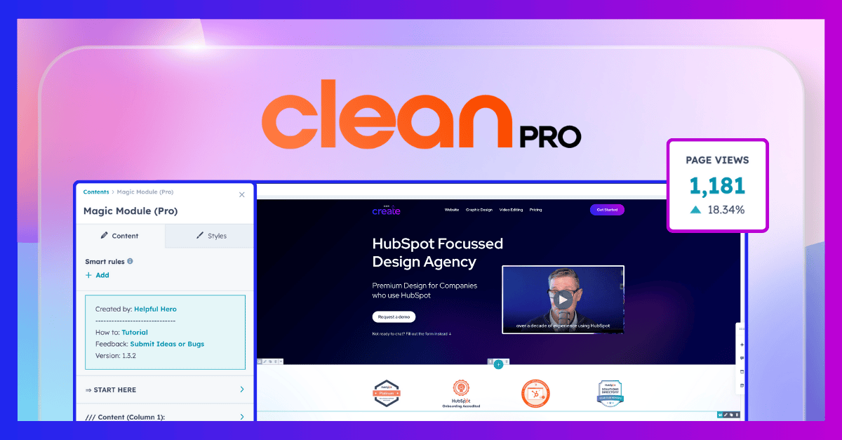
Campaigns move fast. Most websites don’t. That’s the gap we set out to close, and why we build every HubSpot site on the CLEAN theme: a modular...
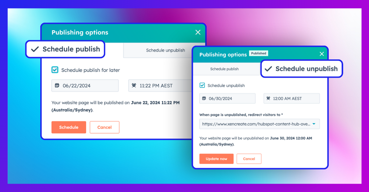
One of the most useful features in HubSpot Content Hub is Schedule Publish. If you're not familiar with it, this feature allows you to schedule a...

Most users won’t tell you if they trust your website. They won’t submit a form to say they felt unsure. They won’t message your team with feedback on...